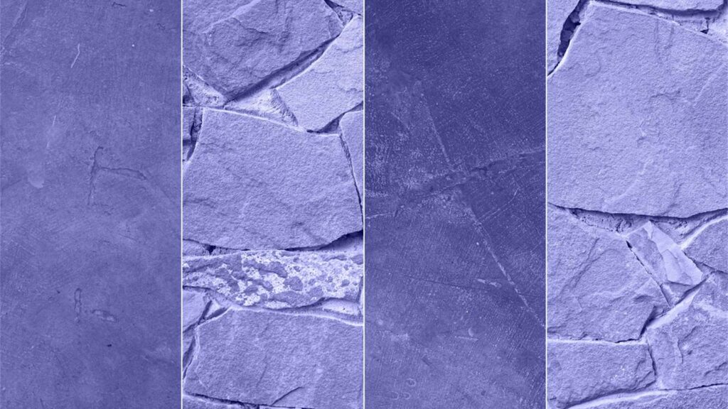
This year all brands are united in their desire to deal with the age of isolation and changes in society. The chosen colors are meant to bring a breath of fresh air into life, as well as a sense of calm that comes from nature. Have a look at them in our article!
Table of Contents
So how are the colors of the year determined?
You may wonder who actually decides on the selection of trendy colors for interiors. Every year, using global trends, findings, and consumer behavior research, our world’s largest paint manufacturers employ the world’s leading designers and architects to select the best colors and hues to be used not only in interior design but in fashion as well.
From the Pantone Color Institute, AkzoNobel, which produces its own Dulux brand of interior paints, has the most significant influence, with companies such as Sherwin-Williams and PPG following.
The Pantone color: the Very Peri violet, combining the stability of blue and the excitement of red
For 2022, the Pantone Color Institute has created an entirely new color for the first time: Very Peri, which is a blue with violet-red undertones, replacing last year’s combination of Ultimate Gray and the bright yellow of Illuminating.
This resulting purple hue is meant to reflect the world’s change after a period of isolation and the opportunities that lie ahead. Most Peri is intended to draw attention to the connection between the reality of everyday life and the virtual world. Representing the power of change encourages creativity and ingenuity.
It is intended to guide us in a world where many new things await us and give us vision as we reshape our lives. She combines gratitude for what we have with the prospect of what is yet to come. The designers say it conveys a rebellious, joyful attitude and a dynamic presence. So how can you use Very Peri in interior design?
Unless you feel like making a significant change, you do not have to completely change the color of your walls right away. It is simpler and cheaper to apply stylish decorations in different shades of this color.
Also Read:
- 5 Mistakes Successful Women Would Never Make
- 7 Reason Why You Should Start Sleeping Naked
- 10 Habits to Improve Mental Health
- Hobbies to Make Money – The Ultimate Guide
- How to Live a Minimalistic Lifestyle in 7 Days
Dulux: bright skies gray-blue and four color palettes
Last year’s warm, more neutral shade of brown, Brave Ground, was replaced for 2022 by the gray-blue shade Bright Skies, which brings a breath of fresh air to the home. Airy, light blue, new, open and invigorating – a color that symbolizes the boundless sky around us. The calming tone integrates nature into everyday life and transforms rooms into a relaxing escape from everyday life’s stress. It is vibrant, optimistic and good for the soul.
Dulux provides four color palettes to inspire you to create different color combinations for maximum impact. The Bright Skies is easy to combine with other colors and can even be used instead of neutral colors. It pairs well with earthy hues like dark blue, yellow, red, green or brown. When you want to boost its energy, just add a bit more vibrant colors. Neutrals like whites, beiges, and black give it a natural look.
Combine Bright Skies with a palette of work colors to create an inspiring space for any activity: living, working, relaxing and more. Add the freshness of nature to your dining room with Greenhouse’s lush green and blue color palette. Combined with Bright Skies, the gentle and airy hues of the Studio color palette conjure a calming space where you can relax and be inspired.
The salon color palette is suitable for creating fresh, open, and inviting spaces. A combination of soft neutrals and warm hues is the perfect foundation for any room in the house. You will find these palettes in the gallery at the beginning of this article.
Sherwin-Williams: gray-green Evergreen Fog
Suppose you enjoy surrounding yourself with colors inspired by nature. In that case, you will be thrilled with the latest selection from Sherwin-Williams, which named Evergreen Fog the color of 2022. It is the symbolic continuation of last year’s Color of the Year, gray-brown Urban Bronze, marking a calming new beginning. It sometimes looks more green; other times gray with a hint of blue in the shadows; in any case, it is subtle looking enough for indoor and outdoor spaces.
PPG color: gray-green Olive Sprig
Elegant, versatile, and very adaptable is Olive Sprig’s grey-green, which this year replaces last year’s shades Beige Transcend, Brick Big Cypress and Blue Misty Aqua. In this instance, designers also responded to the pandemic time spent (and still being spent) in a primarily digital environment, craving authenticity, natural surroundings and meaningful human interaction.
This results in a color that represents regrowth and mimics the resilience of nature, comforting aloe vera or fragrant plants. Olive Sprig is a versatile color that shows well both indoors and outdoors and fits almost any environment. All the colors can be found by clicking on the link and in the gallery at the beginning of the article. Click on the photo to see it in full size.
